
Lustucru, An Iconic Design - Collecting French Vintage Lustucru Enamelware
- Helen@Quintessentially

- Jun 9, 2023
- 2 min read
How did Lustucru pasta, a humble ingredient, become so instantly recognisable across the France and internationally? And why has collecting French vintage Lustcru enamelware become so popular?

Founded in 1911, this brand of pasta or ‘pâtes Français’ has become an iconic French design through genius branding and advertising created by the famous illustrator Synave's who won the initial Lustcru competition with his poster featuring a blue checkerboard pasta box.
The bistro staple of Boeuf Bourginon with pasta 'coquillettes' is more often than not made with Lustucru pasta in the discerning French home. Relying on its identity and authenticity, the recipe has remained unchanged in 110 plus years of production, as they say in a famous slogan, 'Dieu merci'!

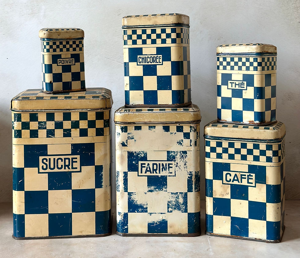
The iconic French blue and white checker board design used on its packets is instantly recognisable. Hand in hand with with the USP of being made with fresh eggs, and therefore ‘good for you’ as well as tasty, its early print adverts and delivery vans spread the design which caught the public imagination.

Soon the blue and white kitchen range became desirable in the ‘modern’ early 20th century kitchen. Coffee pots, épicerie canisters and all manner of kitchenalia was produced, most was the classic blue and white, but red and white was introduced too.
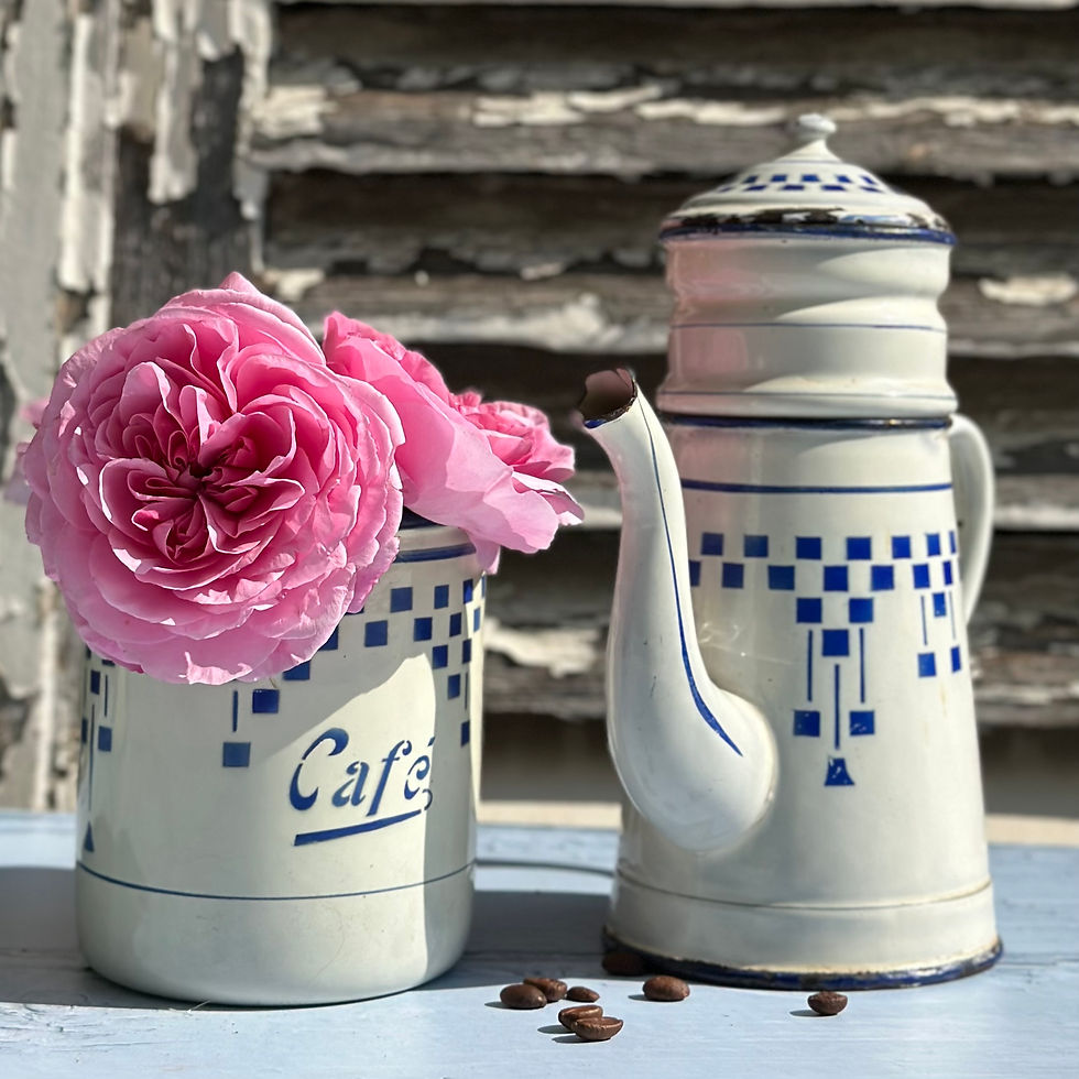
The Lustucru enamelware produced was not only very good quality but was very attractive, and of course, having a coffee pot or set of ‘epicerie’ tins in the kitchen with the checkerboard design influenced the purchase choices in store, as the packets were similarly marked.
Lustcru design enamelware and tins are very sought after today as they are just so attractive and so Quintessentially French.
There are often a few collectible Lustcru pieces on my Quintessentially French website, but do check back regularly as I'm always on the look out for more gorgeous pieces. Subscribe to my newsletter to make sure you don't miss any new arrivals!
The jolly figure of Père Lustucru was used in publicity and as the ‘expert’ in Lustucru pasta, 'he' produced recipe books for use in the family kitchen. His figurines are also now very collectible, his image and wardrobe has evolved over the decades, as has the rest of the product marketing (though keeping to the same recipe!). Here is a very early depiction of him.

Lustcru has evolved to meet its customers demands to remain as a relevant product, popularly rated for being good quality, through of course retaining a healthy dose of nostalgia.
It has moved with the times, from declaring that they use only fresh free range eggs at the end of the 20th century to switching to plastic free packaging for the 21st century. A fine example of marketing over a hundred and twelve years.

The packaging still has the checkerboard design and stands out in today’s French supermarket, of course, c’est Lustucru!


Thank you for reading, do leave me a comment as I'd love to know if you would like me to blog about more classic French brands.


Loved the article as I also collect Lustucru enamelware and it was interesting seeing some of the background - although I thought the enamelware was promotional with the sales of the pasta (?). I would be very interested to read something about Digoin as I have a couple of Digoin pieces (yoghurt pots), and I know Digoin is still going strong. Thank you!
Love this, a wonderful history that I wouldn't have known otherwise! Yes, please, more French brand history would be delightful!